Front
Back
Overview
National Grid’s annual "Wellbeing Week" aims to promote health and wellness among employees through a range of activities like fitness, massage, healthy eating, volunteering, and personal development. I was tasked with designing a four-page brochure for their "Five Days for Five Ways to Improve Your Wellbeing" campaign. The brochure was intended to serve as a marketing tool leading up to the event and a guide for participants during the week.
Objective
The goal was to create a brochure that was visually engaging, clearly communicated the week’s activities, and aligned with National Grid’s brand identity. The design needed to motivate employees to participate by highlighting the variety of wellness opportunities available.
Challenges
The challenge was to design a cohesive brochure that balanced both the informative aspect (the event schedule and daily themes) with an inviting, friendly look that encouraged participation. Additionally, the brochure needed to reflect inclusivity, making it clear that Wellbeing Week catered to all employees, including those with specific health needs or interests.
Process
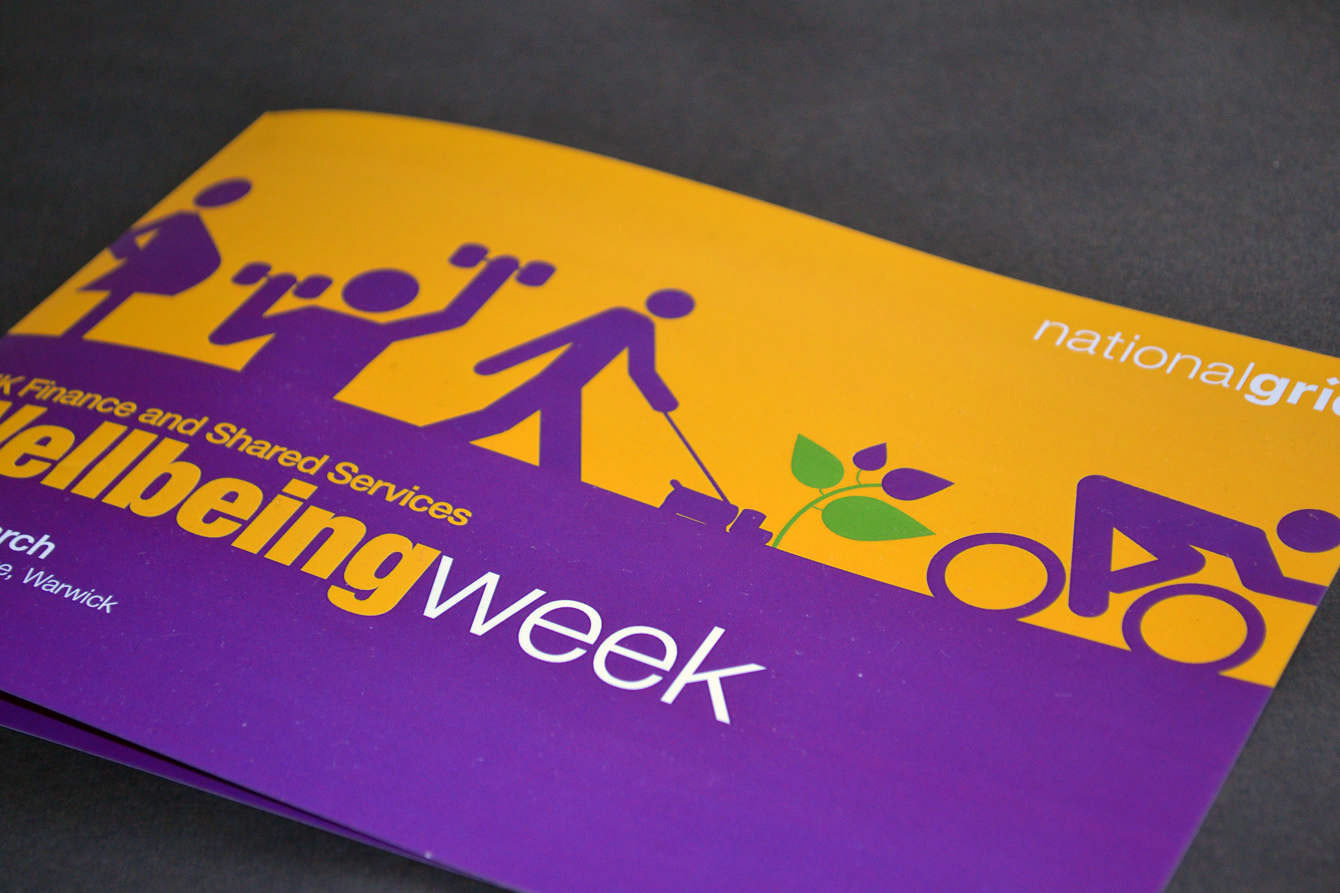
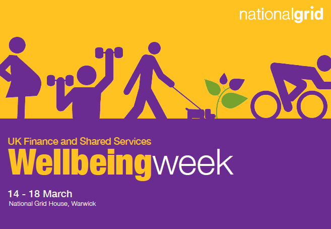
1. Design approach and colour selection: I selected National Grid’s purple and yellow brand colours for their bold, eye-catching contrast. Purple conveyed a sense of calm and wellbeing, while yellow added warmth and energy to the design. This palette helped ensure that the brochure felt both professional and inviting.
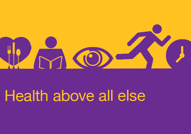
2. Front and back design elements: The front and back covers of the brochure featured illustrations that highlighted different healthy activities, such as exercise, relaxation, and balanced eating. These visuals immediately conveyed the essence of Wellbeing Week, creating a sense of energy and positivity.
3. Incorporating inclusive imagery: One of the key figures featured in the design was a pregnant woman. Her presence in the brochure symbolised inclusivity and underscored the fact that Wellbeing Week catered to everyone—whether they were interested in fitness, healthy eating, or making lifestyle adjustments for specific needs, such as pregnancy. This helped reinforce the message that the event was about making healthy choices at all stages of life.
4. Content layout: Inside, the brochure was organized around the "Five Days for Five Ways to Improve Your Wellbeing" concept. Each day featured different themes related to physical and mental wellness, and the layout provided clear, easy-to-read information on the various activities employees could participate in throughout the week.
Final Design
The final brochure combined a vibrant purple and yellow color scheme with welcoming illustrations that represented a variety of wellness activities. The design was both informative and inclusive, appealing to a broad audience, from fitness enthusiasts to those focused on holistic wellbeing, including expectant mothers. The layout made it easy for employees to navigate the week’s events, with a consistent, user-friendly flow from cover to cover.
Results
The brochure was a key part of the marketing campaign, successfully drawing attention to Wellbeing Week and guiding employees through the range of available activities. Feedback from National Grid highlighted how the design’s balance of vibrant colours, inclusive imagery, and clear organisation contributed to increased employee engagement throughout the week.
Client Testimonials
"Kim has provided the comms team with a huge amount of support. Not only with specific events such as 'Stress Awareness Day', but also through her knowledge and expertise in effective communication. In a short space of time, Kim has made some significant improvements to some of our channels -- many of which we have simply not been able to do until now."
--Head of Communications, UK Shared Services, National Grid
--Head of Communications, UK Shared Services, National Grid