Overview
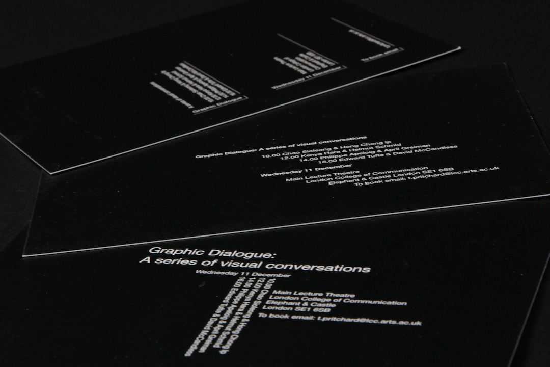
For this project, the task was to create an A3 poster and a set of three notification cards for a one-day conference entitled "Graphic Dialogue," hosted at the London College of Communication. The brief provided a focused exploration into type hierarchy—experimenting with typography to examine how emphasis, structure, and hierarchy can be communicated within text-based designs.
Design process
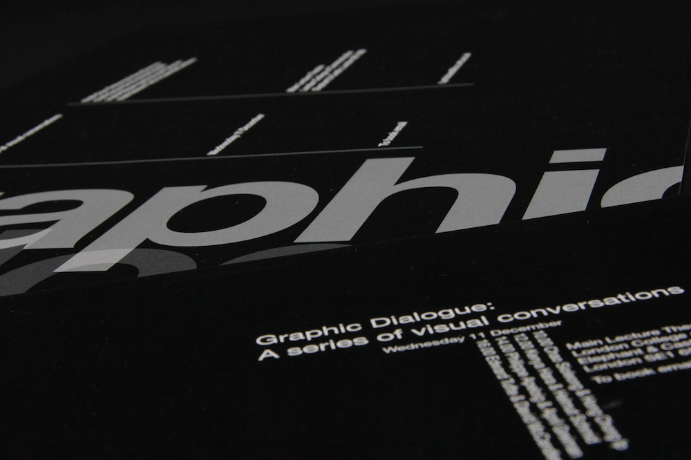
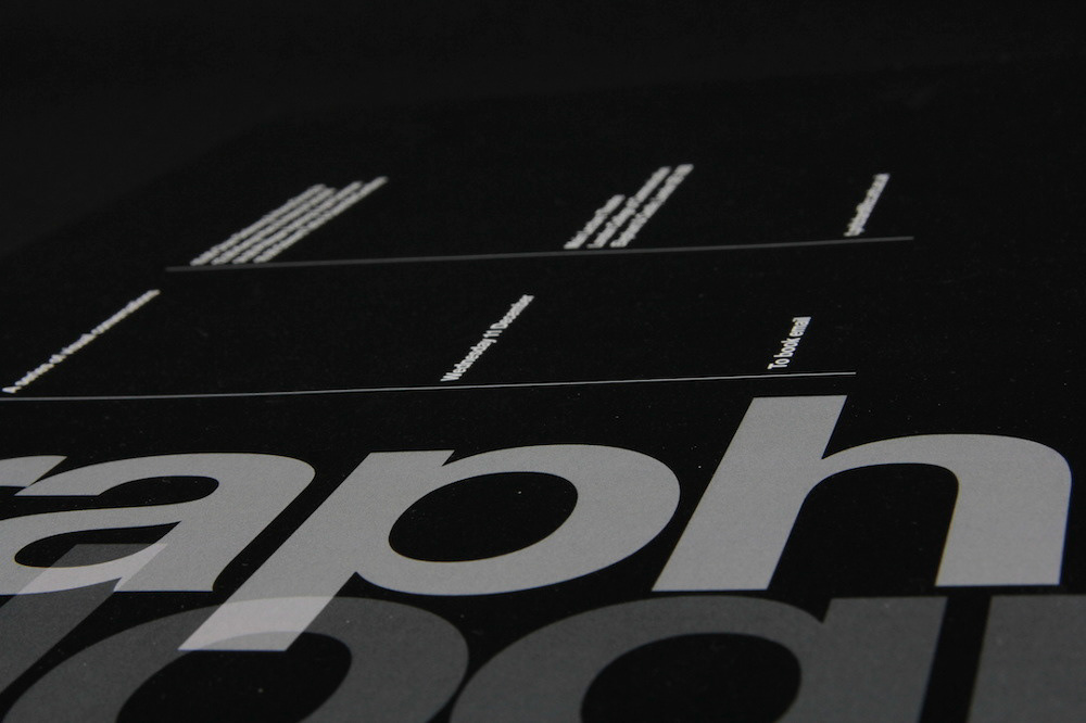
I explored various methods of creating visual emphasis, primarily through the manipulation of type weight, size, and positioning. The goal was to ensure clarity and visual hierarchy so that the most important information stands out while maintaining a cohesive and professional design.
Outcome
The final designs use a clean, minimalistic approach with strong typographic elements. The visual hierarchy guides the reader’s eye to the key information, effectively balancing the conference details while maintaining aesthetic appeal. The project was printed on high-quality matte card stock to enhance the visual clarity and professionalism of the final design.


