Overview
The brief for the Type Classification project was to create a visual documentation and exploration of the different formal qualities of at least six typefaces. Rather than approaching this task in a purely academic way, I decided to inject a playful element and use it as an opportunity to develop my animation and motion graphics skills.
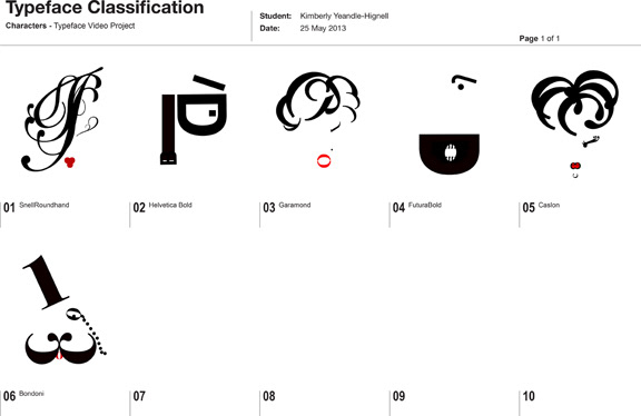
After researching a range of typefaces, I selected six based on their historical significance, visual characteristics, and the unique qualities they possess. The chosen typefaces were Helvetica, Futura, Caslon, Bodoni, Garamond, and Snell Roundhand. Each typeface inspired the creation of a unique character that embodied its formal qualities—such as geometric forms, clarity, or connected script.
Process
I first designed the characters in Adobe Illustrator, breaking each character into individual components for easier animation. Each part of the character was then imported into Adobe After Effects, where I layered and animated the expressions and movements with precision and careful timing to bring each one to life. Adobe Premiere Pro was used for editing the final sequence and refining the overall video.
To further enhance the experience, I selected music for each character that corresponded to the time period in which the typeface was created, adding a historical dimension and deeper connection between the character and its era. The voiceover for each character was performed by myself (for Caslon and Snell Roundhand), Paolo Coppo (for Garamond), and Ashley Williams (for Helvetica and Futura). This collaborative element added depth to the characters, ensuring each one was brought to life not only through animation but also through voice.
The video combined these animated characters with a narrative play that linked each character to the unique qualities of its typeface, creating an engaging and educational visual journey through type classification.
Character design & development
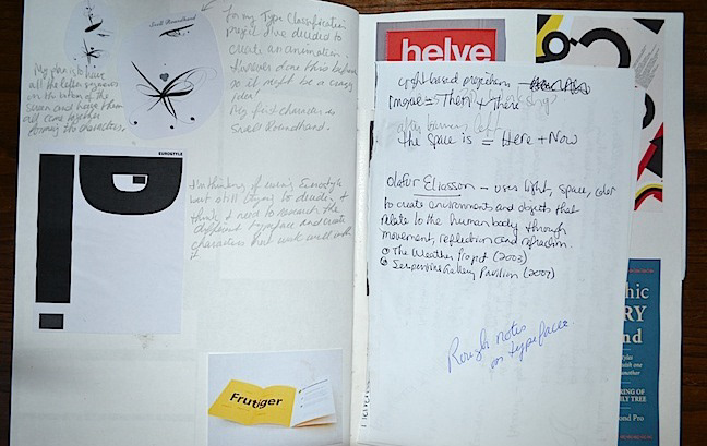
Early sketches/notes and final designs for animated type characters.

Sketchbook work

